This workflow is built to compare Modeled Soil Moisture Storage against Observed Well Water Level.
Note: As of 9/2/2024 the package is formatted to process CABCM and TerraClimate data. As NextGen data becomes available any adjustments that need be made to allow it to work within this flow will be made. Until that point, this document will refer to CABCM and TerraClim data with the implication that NextGen could be substituted for either at any point.
Comparing Model and Observed Soil Moisture, correlating the two, producing plots and maps for visualization.
This workflow assumes access to the tnc-dangermond bucket and its folders which contain the updated site data for the Dangermond Preserve.
Similar to WaterBalance, to start you need Site Location and Basin Data
Divides
You also need to bring in your Basin Divides for mapping purposes.

To get our data from the tnc-dangermond bucket we will need to pull the parquet data from S3 and organize it into a list.
Note: If you already have your site data, and it is formatted like the output of CleanWells(), you can skip straight to the Change In Storage From the Model step.
Intersect the Site Data and Divides to get a dataframe of all your divides with all the sites that they contain.
#dangermond_sites <- st_intersection(All_Sites_sf, NewDivides)
Clean up the data a bit.
The TNC Site names get wonky so replacing any spaces with underscores, filtering out NA values, and just pulling out the Site and Divide (to be used later) fields will help. Active Divides will be used in the CleanWells() function below.
Additionally, creating a SiteBasins df that is just the distinct Basin IDs is necessary if you want to pull well data from the TNC Bucket.
##Join Divides and Sites
#ActiveDivides <- dangermond_sites %>%
#  filter(!is.na(SiteName)) %>%
#  mutate(Site = str_replace_all(SiteName, "_", "")) %>%
#  dplyr::select(Site, Divide, has_flowline)


#Site Basins
#SiteBasins <- ActiveDivides %>%
#  dplyr::select(Divide) %>%
#  distinct(Divide)
Clean Well Data
CleanWells()
For this example I will be using “all_combined_data” which is compiled from the TNC Sensor data at the Jack and Laura Dangermond Preserve. If you have the correct credentials you can pull this data as well, to do so you will need the SiteBasins df created above.
#monthly_basin_average <- CleanWells(x = all_combined_data, y = ActiveDivides)This function filters, transforms, and processes well water level data from a combined dataset. It prepares the data for mapping and analysis by calculating changes in well water levels, joining with basin information from ActiveDivides, and summarizing the data on a monthly basis.
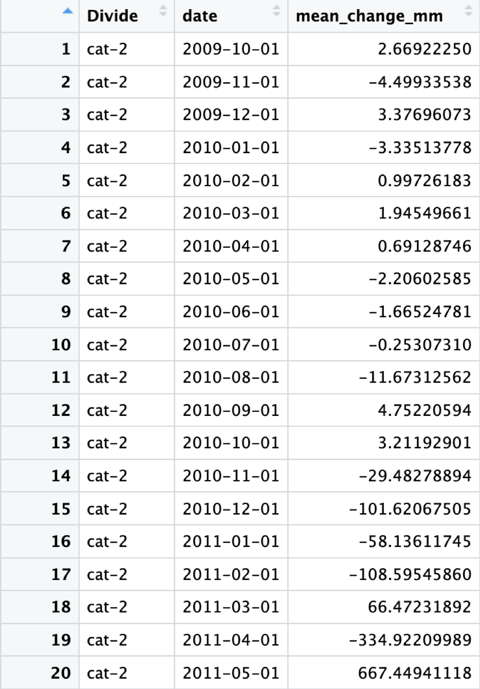
The output should look like this, time series data for all divides containing sites that are measuring well water level, and the average change in well water level from month to month:

After Running CleanWells() you should also create a UniqueDivides dateframe
This will be used in the next function as well.
#  UniqueDivides <- monthly_basin_average %>%
#    distinct(Divide)
Change In Storage From the Model
Now that we have the site data, we can use the (model)_delta_str file from the WaterBalance workflow and compare the two.
Join Hydro Data
The JoinHydroData() function merges well water level data with change
in storage data from our models for further analysis. The storage data
is filtered to include only non-negative values and specific date
ranges. The function limits the data to basins present in the
UniqueDivides dataset.
#cabcm_dangermond_join <- JoinHydroData(x = cabcm_delta_str, y = monthly_basin_average, z = UniqueDivides)Correlation
Next you can use the Correlation() function, which computes the correlation between changes in well water levels and modelled change in storage for each divide (basin). It calculates standard deviations of well water levels and storage, computes correlation coefficients, and merges these correlations back into the original dataset.
#cabcm_corr_join <- Correlation(x = cabcm_dangermond_join)The output should look like this, it even adds convenient plot titles!

I’ve called this dataframe “cabcm_corr_join”, no need to get too fancy.
Now that our data is looking good we can finally make some plots
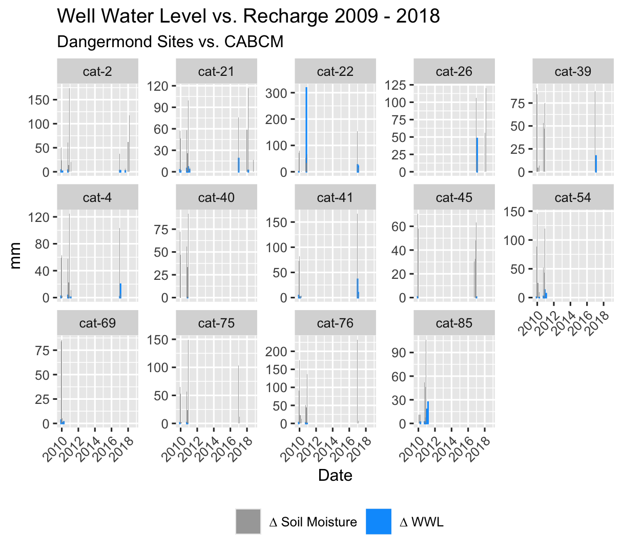
Plot_WWLvsSTR() does exactly what you think it will. It plots the change in well water level “mean_change_mm” against deltaSTR from your model data.
#cabcm_Plot <- Plot_WWLvsSTR(x = cabcm_corr_join)

#cabcm_Plot
This is a great visualization of the accuracy of the model to the basin in terms of both timing and magnitude of changes in well water level vs modeled changes in soil moisture.
If we want more detail, making a scatterplot of the two should help, and we can then attach that to a map to make it an even more powerful visual aid.
ModelScatter()
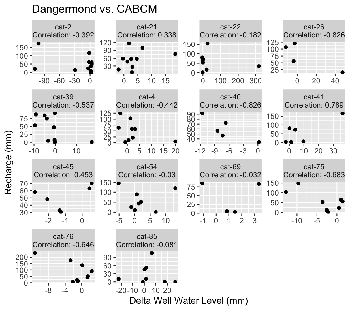
ModelScatter() uses the same data as above, but makes a scatterplot instead.
#ModelScatterPlot <- ModelScatter(x = cabcm_corr_join)

#ModelScatterPlot
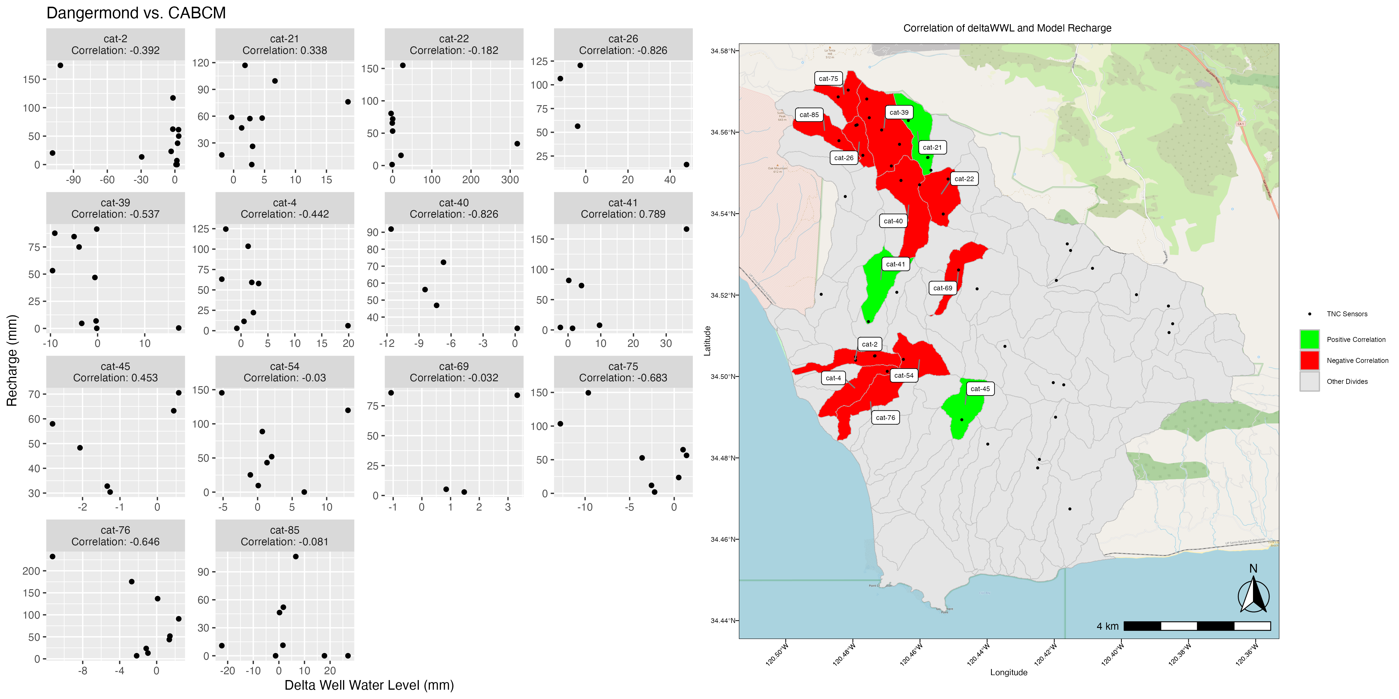
This is good, it shows us the general shape of the data and the correlation is easily visible as part of the title. But how does it relate spatially to our basin?
ModelCorrMap() uses model_correlation_by_divide, which is an output of Correlation() along with the scatter plot we just produced to create a side-by-side plot of the two.
#Corr_Map <- ModelCorrMap(x = cabcm_corr_join, y = ModelScatterPlot, z = NewDivides)
